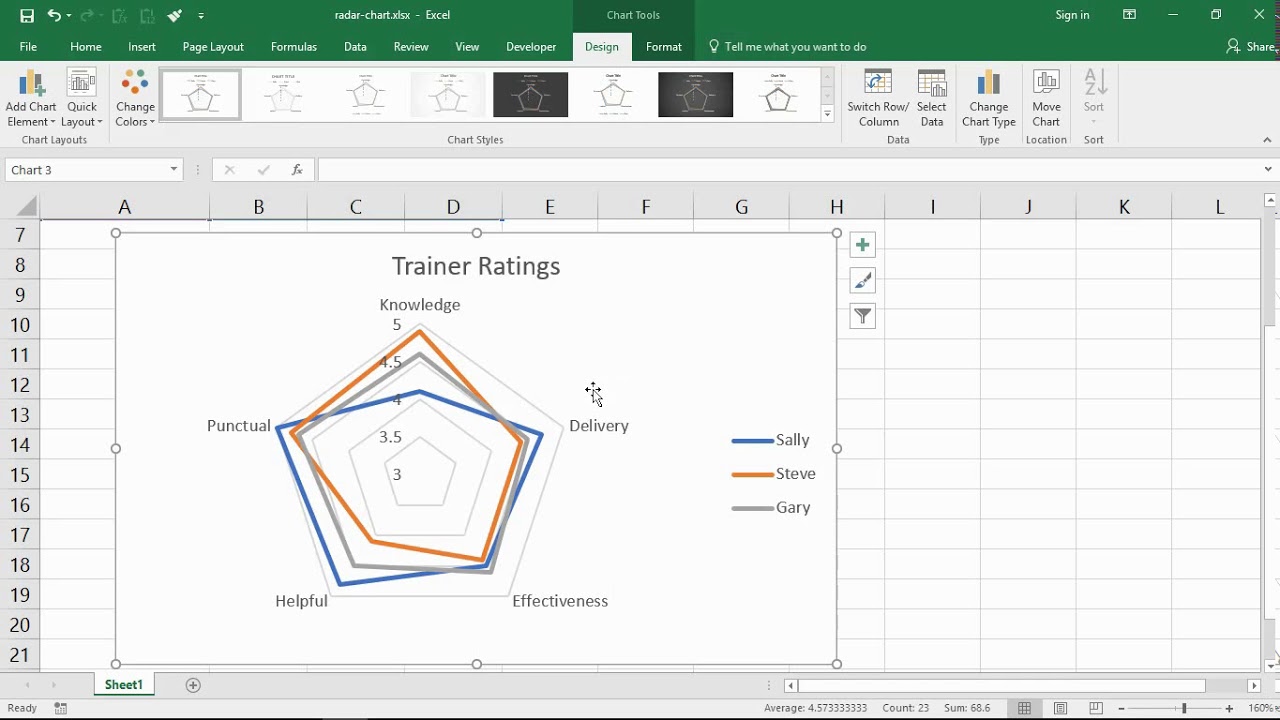
Radial charts, also known as circular bar charts, visually compare categories using concentric circles. Excel doesn't have a native radial chart type, but you can create one effectively using a stacked column chart combined with a radar chart.
Prepare Your Data
Structure your data correctly:
- A1: Empty
- B1, C1, D1, etc.: Your category names (e.g., "Marketing", "Sales", "Support").
- A2: "Placeholder"
- A3: "Axis Labels"
- A4: "Values"
- B2: Enter a large number representing the maximum possible value on your rings (e.g., 100 if using percentages). This creates your outer ring.
- B3: Enter the max value again (e.g., 100).
- B4: Enter your actual data value for the first category.
- Repeat columns B2:B4 for each category (C, D, etc.).
Create the Base Chart
- Select your entire data range (A1:E4).
- Go to Insert > Charts group > Insert Column or Bar Chart.
- Choose Stacked Column.
Convert Series to Radar Chart
- Right-click any visible data bar in the chart.
- Select Change Series Chart Type.
- Find the Placeholder series. Change its chart type to Radar with Markers. Ensure "Secondary Axis" is checked for this series.
- Find the Axis Labels series. Change its chart type to Radar with Markers. Ensure "Secondary Axis" is checked for this series.
- Leave the Values series as a Stacked Column.
- Click OK.
Format the Chart
- Delete the Legend (select and press Delete).
- Remove Primary Vertical Axis: Select it and press Delete.
- Format Secondary Vertical Axis: Right-click it > Format Axis.
- Set Minimum = 0, Maximum = your max ring value (e.g., 100).
- Set Major unit to control ring count (e.g., 20 for rings at 20, 40, 60, 80, 100).
- Format the "Placeholder" Series: Right-click the "Placeholder" radar line > Format Data Series.
- Set Fill to No fill.
- Set Border to Solid line, choose a thin, light grey line. This creates the rings.
- Format the "Axis Labels" Series: Right-click the "Axis Labels" radar markers > Format Data Series.
- Set Marker to None (No markers).
- Set Line to No line.
- Format the "Values" Columns: Right-click one of the value bars > Format Data Series.
- Set Fill to your desired color.
- Set Gap Width to 0% (makes columns meet the rings).
Add Category Labels
- Select the Secondary Horizontal Axis (radar axis labels).
- Right-click > Format Axis.
- Under Axis Options > Labels, set Label Position to Low.
- Link Labels to Cells (Optional but Recommended):
- Right-click the chart > Select Data.
- Select the Axis Labels series, click Edit under "Horizontal (Category) Axis Labels".
- Select the cells containing your category names (B1:E1).
- Click OK twice.
Final Touches
- Remove Axes: Select and delete the Secondary Vertical Axis and Secondary Horizontal Axis.
- Add Data Labels (If Needed): Right-click the "Values" column > Add Data Labels. Format labels for clarity. Note: Labels often display better on a dummy "Label" series added later using XY Scatter.
- Adjust Ring Labels: Click once on a ring label (e.g., "100"), then click it again to select just that label. Type the desired text (e.g., "100%" or just "100"). Repeat for each ring.
Key Tip: The "Placeholder" max value controls the ring sizes. Increasing it makes bars shorter relative to the rings.