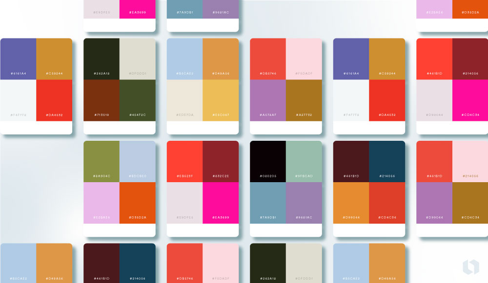
Master color scheme selection by understanding core principles and applying strategic frameworks. Start with the 60-30-10 rule: use a dominant color for 60% of the space, a secondary for 30%, and an accent for 10%.
Leverage Color Theory Fundamentals
Utilize the color wheel effectively:
- Analogous: Adjacent colors (e.g., blue, blue-green, green). Creates harmony.
- Complementary: Opposite colors (e.g., orange and blue). Maximizes contrast.
- Triadic: Three colors equidistant (e.g., red, yellow, blue). Offers vibrancy.
- Monochromatic: Tints, tones, and shades of one hue. Ensures cohesion.
Prioritize Context & Audience
Consider psychology and environment. Cool tones (blues, greens) suggest calm; warm tones (reds, oranges) evoke energy. Ensure alignment with brand identity and target demographic expectations.
Ensure Accessibility & Contrast
Use contrast checking tools to meet WCAG standards. Ensure sufficient contrast between text and background (minimum 4.5:1 for body text). Avoid relying solely on color to convey information.
Practical Application Steps
- Start Neutrally: Build foundation with blacks, whites, grays.
- Add Dominant Hue: Choose primary color reflecting desired mood.
- Select Secondary/Accent: Apply chosen scheme (complementary, analogous, etc.).
- Test Iteratively: Evaluate schemes under different lighting/devices.
- Limit Palette: Stick to 3-5 core colors for clarity.
Pro Refinement Techniques
- Adjust Saturation: Use muted tones for backgrounds, high saturation for accents.
- Employ Tints & Shades: Add depth and flexibility without new hues.
- Consider Undertones: Ensure neutrals have consistent warm or cool bases.
- Study Successful Examples: Reverse-engineer palettes from high-impact designs.
Focus on balance, purpose-driven choices, and rigorous testing to create striking, professional palettes consistently.